


Several things came together and prompted this post about the oil crises we all are facing. The first was the war in Iran of course. The second was spending some time consolidating 50 years of files of agenda designs and graphics in a storage locker as a result of consolidation at The Grove. The third was facilitating a Team Performance Community call focused on “Using Graphic Guides to Manage Up.” I shared this image I found in my files review.
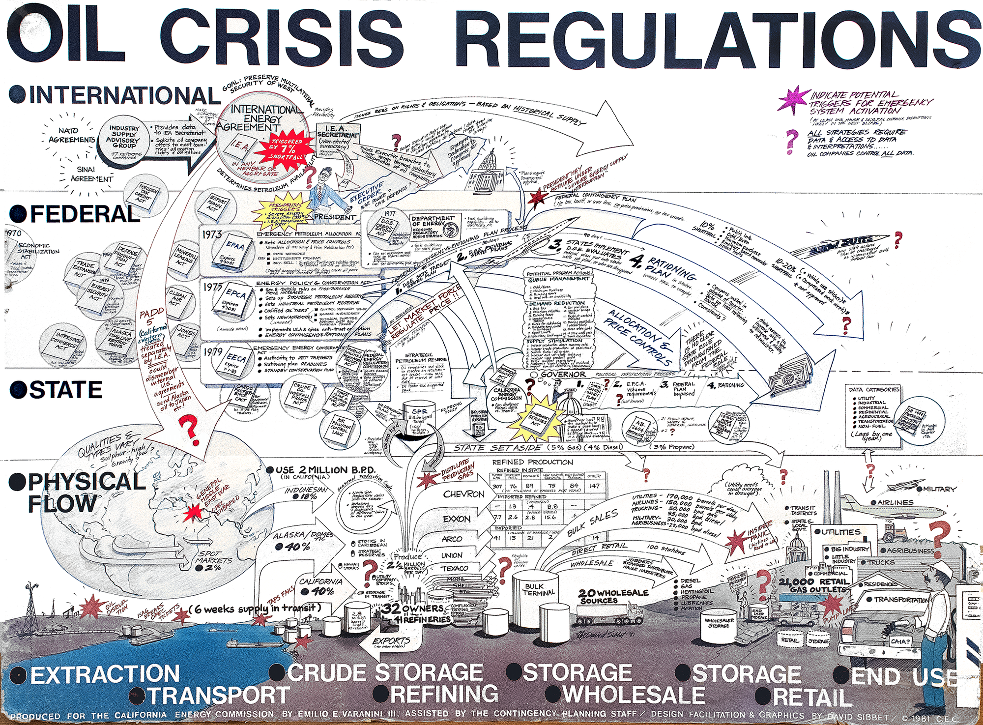
This poster is the most impressive example of how to use carefully designed information graphics to affect higher management. In this case it was the President of the United States, Ronald Reagan, in his first year in office. Let me shore the story.
Can You Help Us?
In 1980 I received a call from Emilio Varanini, director of Governor Jerry Brown’s Energy Commission in California. The state had just weathered the several oil shocks in the 1970s, when on several occasions the oil cartels constricted supply and sent markets reeling. This precipitated California lawmakers to pass an Emergency Services Act in the mid 1970s requiring the Governor to have a state contingency plan in the event of another oil crisis. “We’ve assembled a team of experts here at the Energy Commission and had several meetings but are making no progress,” Emilio said. “Can you come and help us?”
Emilio knew of my work through his affiliation with the Coro Center for Public Affairs, an organization I’d worked for from 1969-77. In 1980 I was three years into creating Sibbet & Associates and facilitating regularly in Sacramento. I arrived with my blank paper and pens and was introduced to a team of a dozen analysts by Emilio.
Mapping the Physical Flow
“Let’s start with what we know at a ground level,” I suggested, fully appreciating that any contingency plan would eventually consider other very dynamic levels involved politics, that we start with provable data. The initial chart mapped the physical flow part of the graphic shown here.
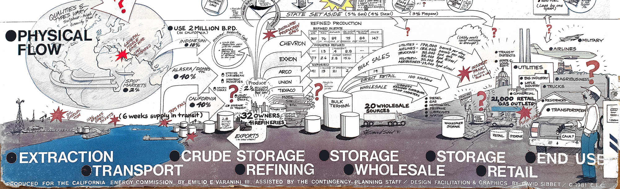
I know from many system mapping efforts, that most people know what I call a “freeway level” view of the major parts of any system. The street maps are always much more complex. At the freeway level everyone easily agreed that oil starts with extraction, then on to transport, crude storage, refining, storage, wholesale, storage, retail and end use. Two insights emerged. One was the complexity arising from the fact that oil refining produces multiple products, and it makes a difference if it is “light,” “medium” or “heavy” oil that is being refined. Without attempting a technical analysis, I learned that California relies on a smaller supply of light or sweet crude form Indonesia to offset the heavy or “sour” crude from California wells. Then any refining produces a range of products. Along with motor gas there is aviation fuel, distillates, and low and high Sulphur residuals. A contingency plan would have to take all this into account.
A surprise was finding that no one in the room had any idea how much oil was in crude storage in the state, or in refined storage, or in retail storage. These are the red questions marks on the chart. Why didn’t anyone know? Because oil companies don’t release this kind of data.
Mapping the Regulatory Landscape
We took a break around lunch time, and I dropped the first chart down to the floor and added a second white sheet above. Now we would look at the State, Federal, and International legal terrain to see what was in place. (This kind of image is what we now call “context mapping” and is usually essential in providing a baseline for any planning). We mapped legislation to the different phases of the physical flow and developed this part of the picture.
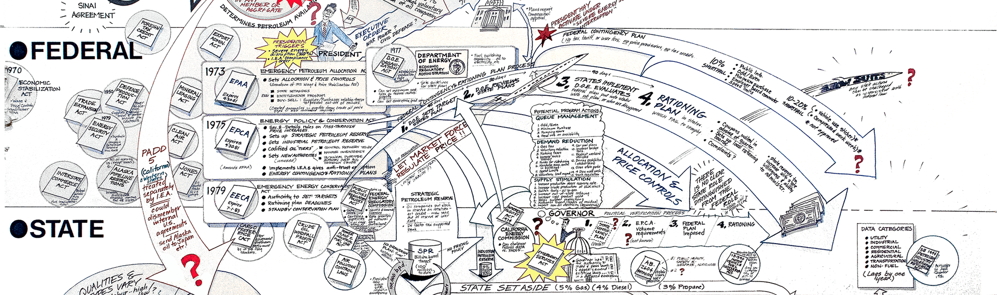
I won’t try and explain all these laws, but the central Federal laws in the boxes were driving the others, and each aimed at regulating things in a different way. The Strategic Petroleum Reserve emerged from a 1975 Energy Policy Conservation Act. This also activated a state set-aside. A late Emergency Conservation in 1979, passed after another oil emergency in 1978, set out a process for rationing along a series of categories with utilities and industries on top. By 1977 there was now a Department of Energy trying to oversee all this and a Federal Contingency Plan had evolved that could activate under a severe disruption of 10%. But President Regan could only act if there was a 20% shortfall.
The questions in this part revolved around a state’s power to reallocate oil distribution from the Petroleum Allocation Districts or PADDs.
International Control by International Energy Agreements (IEA)
At this point we all came to appreciate that the key to any response to any of the many laws looking to regulate oil was completely in the hands of the oil industry.
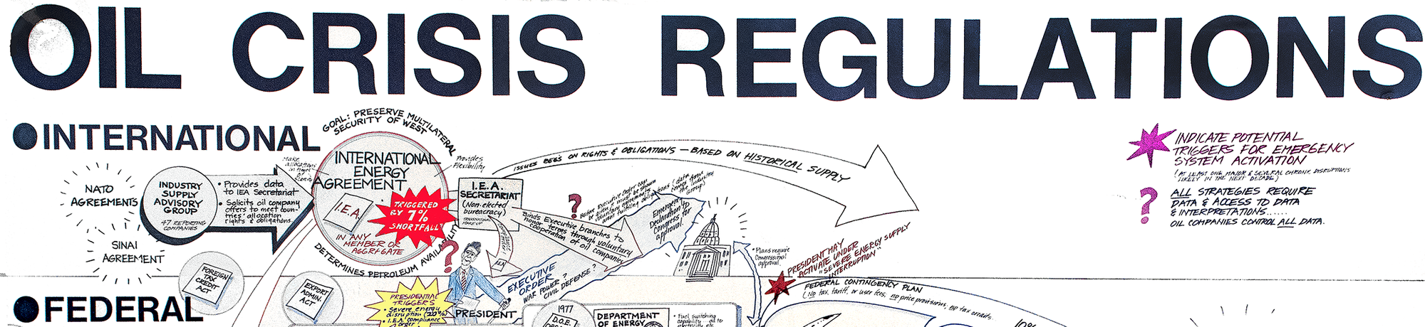
An Industry Supply Advisory Group supplies all data about oil to an I.E.A. secretariate. A 7% shortfall allows the I.E.A. to reallocate oil from the different PADDs. This comes well before any federal or state response is possible. Everyone is completely dependent on the I.E.A.
Back in my studio I create a translation of my wall charts into the graphic posted here. Emilio brought a lawyer to my studio to check all of the references to make sure all the names and data were correct. A refinement pass resulted in this graphic.
Managing Up
The next move surprised me. Emilio Varanini wanted this image in large poster form so he could take it to Washington DC and brief President Regan. We printed the larger version, and Emilio did indeed take it to Washington. His bottom-line message was “this system does not work!” I’m sure other more colorful expletives were used in private, but the effect was marked. People could make all the public reassuring statements they liked, but the regulatory system itself was broken.
Does any of this feel familiar? It sure does to me, except not only is there a web of additional legal complexity but trust in the rule of law is being severely tested. What do organizational leaders and regulators know? What the oil companies tell them.
There was a follow up to this project. The Energy Commission felt that there should be a special briefing system for legislators and The Governor modeled after this chart, but refined to the basic flows, with 5-6 windows where data from spot prices of crude could be posted in an actual crisis. While the spot prices were not precisely indicating amount of storage or supply, they provided a clear basis for decision and inference.
That leg of the project did not come to fruition as attention eased in the early 1980s and no further oil crises emerged (until now).
Reflections
I’m left with an appreciation of how much we all want to believe there are answers for fundamental systems issues like oil supply. We yearn for it regarding global warming data and potential impacts. We wish there were some clarity about the impact of removing productive immigrants from our workforce. While exercises like producing the Oil Crises Regulation poster don’t reveal a reliably “true” picture, the process of creating it educated a large number of people in Sacramento and Washington about the complexity of the situation they were all facing. Often that humility is what powerful leaders need most when they move to action. Hmm. So much to consider in these times.
Please subscribe in the nav for free access. But become a contributing member here to get full access to all posts, response to your comments, and follow works in progress. Join readers supporting decades of insight in organizational development and visual facilitation.